+Additional Branding

Sweets & Piñatas Bakery Branding
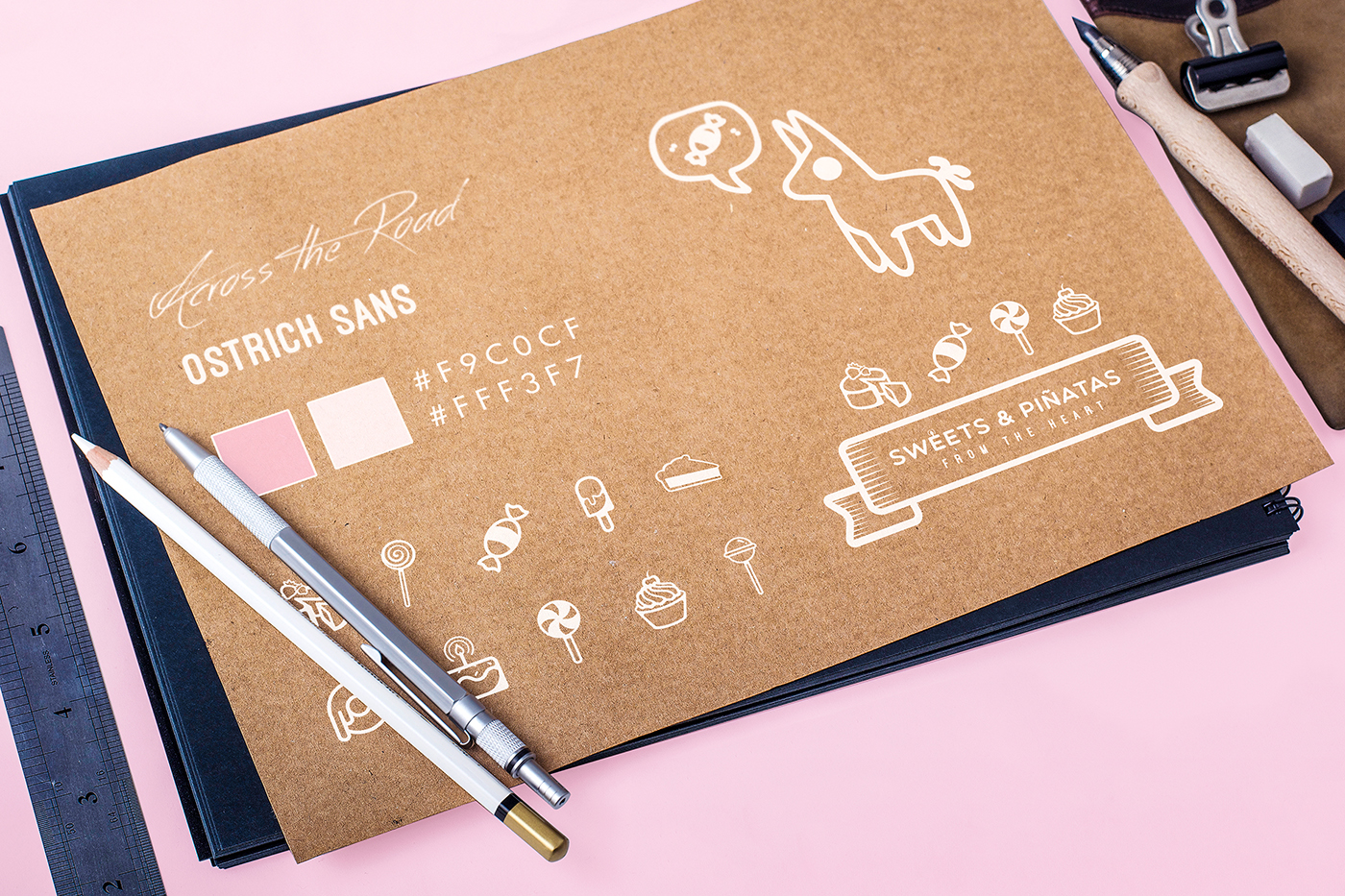
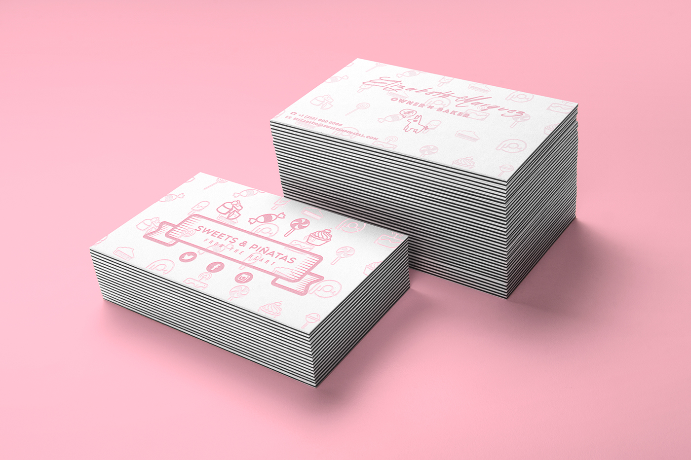
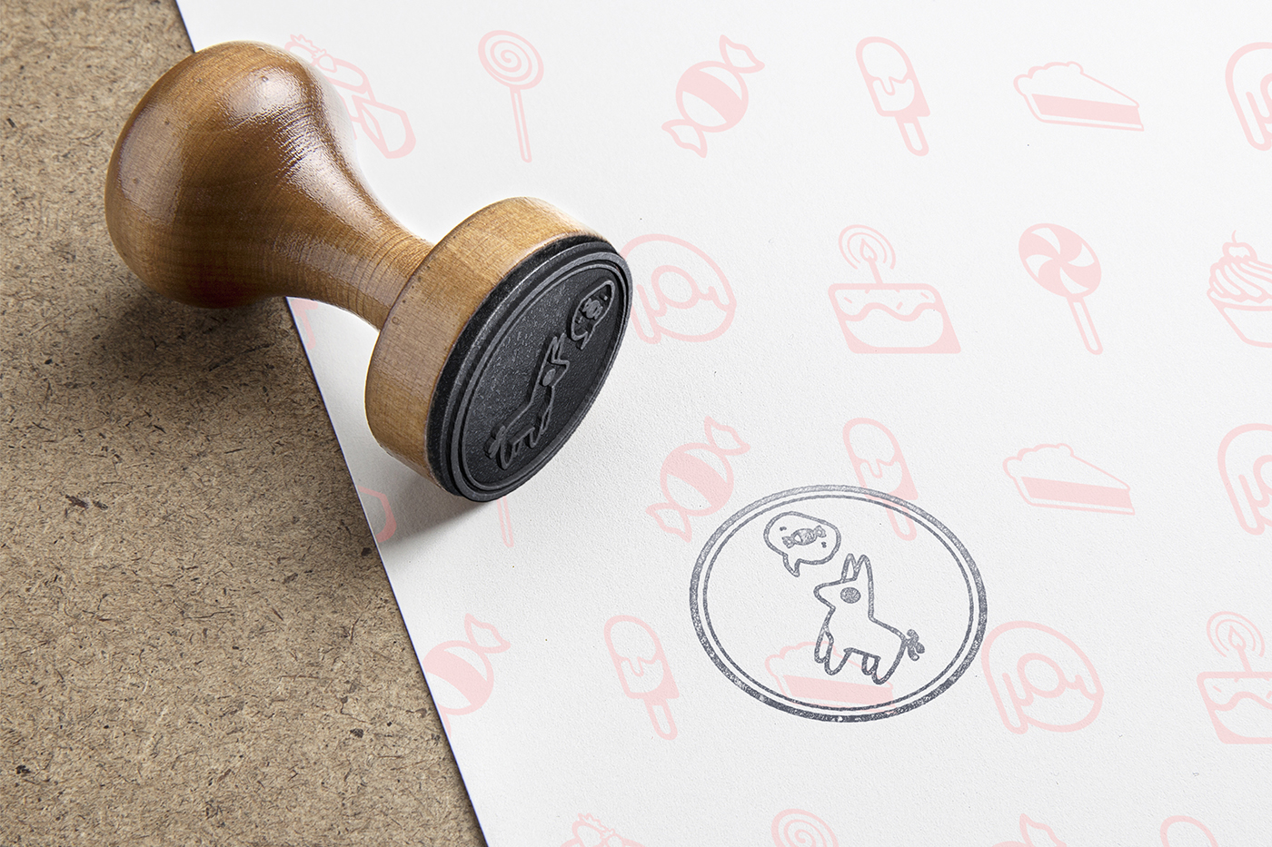
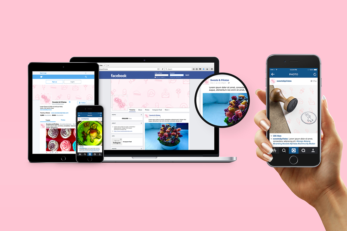
Concept Resonating with the personality of the client's creativity, the art direction was to blend the literal two words of the business; "Sweets" and "Piñata". Originally, research has led to numerous different cultural origins and symbolism of the piñata, but has been widely identified with the Mexican culture with the pointed star. Trying to stray away from a cultural art direction, the use of a playful iconic mascot wanting candy shows a unique blend of irony and humor in what we know the modern use of piñatas are today.
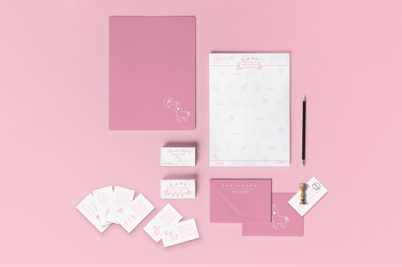
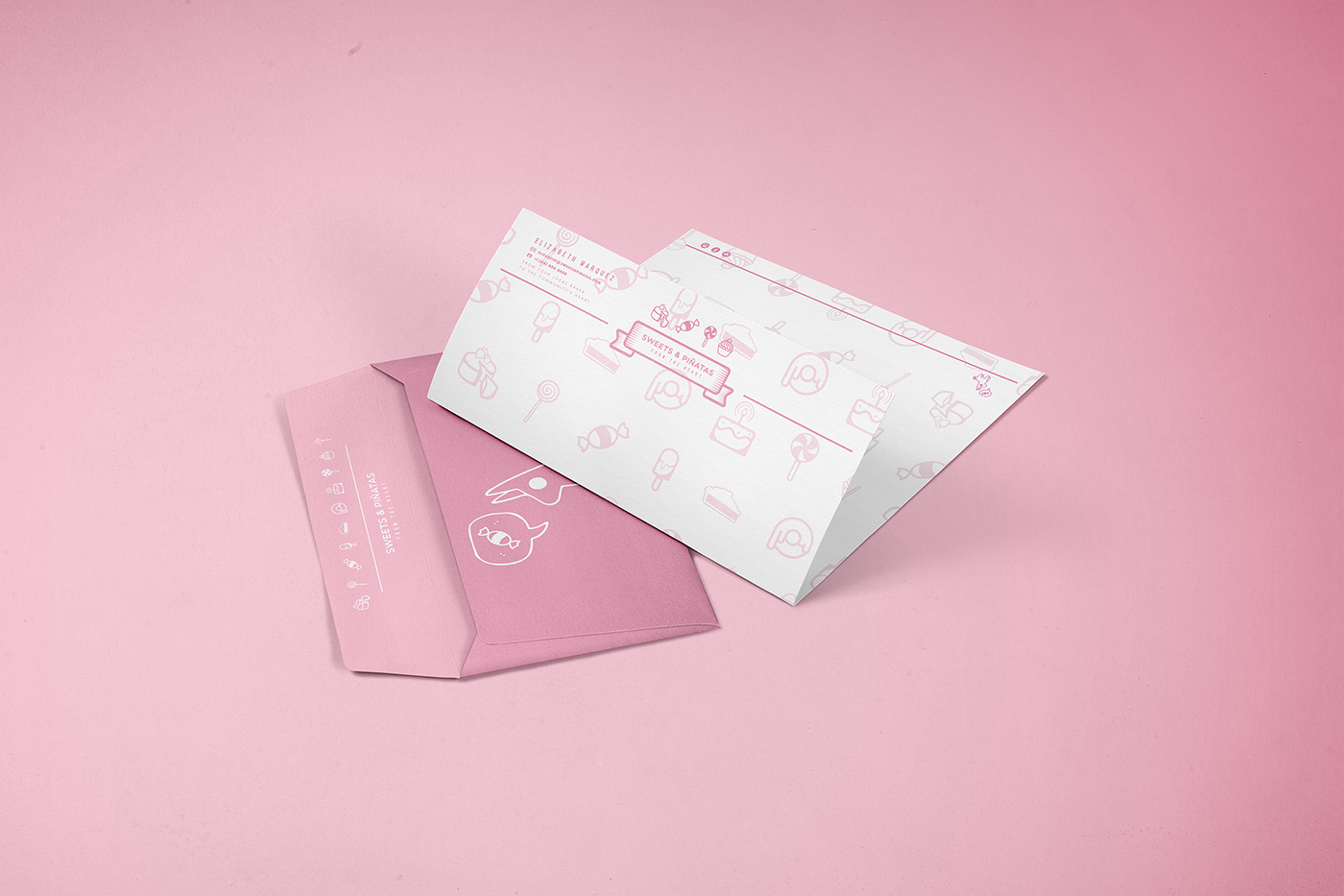
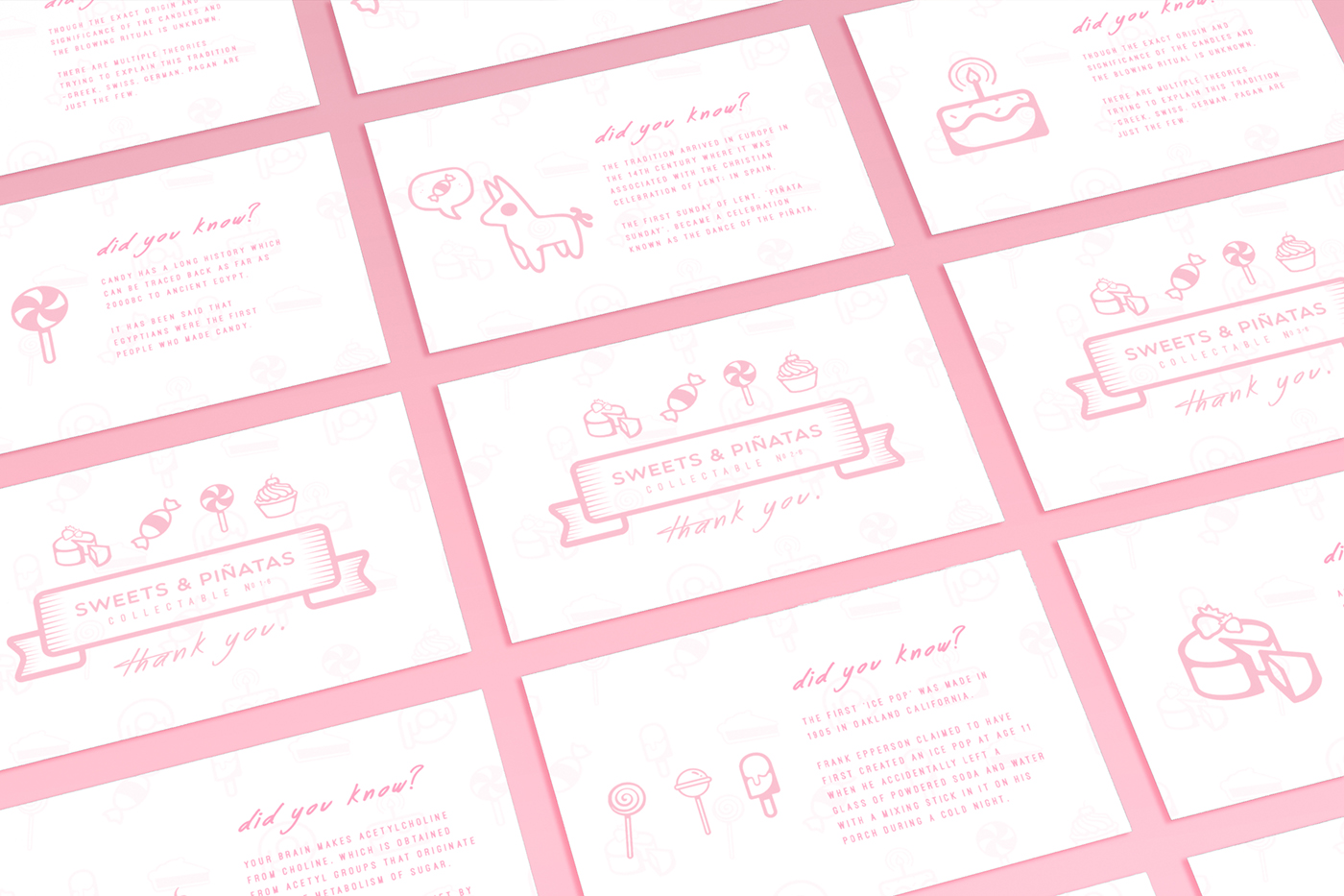
Deliverables Working within the client's methods of communication and contact, the deliverables included stationary branding, redesign for social media channels and a small "thank you" card for each customer.
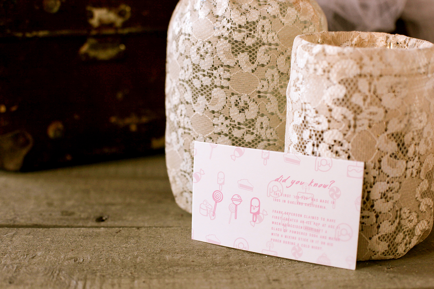
Thank You + Fact Card Set The idea was to give customers specially numbered cards that they can collect. A set collection, each individual card would have historical information about anything from when the first "Ice Pop" was created to candy being traced back to ancient Egypt.
The cards would be given at random with each order and during special offerings, a unique set of three would win a free order. Think of collectible cards and the lottery, but easier; the chances you get that lollipop-donkey-cake combo is high.
Role Art Direction + Creative Direction + Graphic Design
The Pipe Depot Rebrand
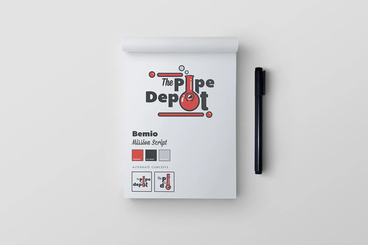
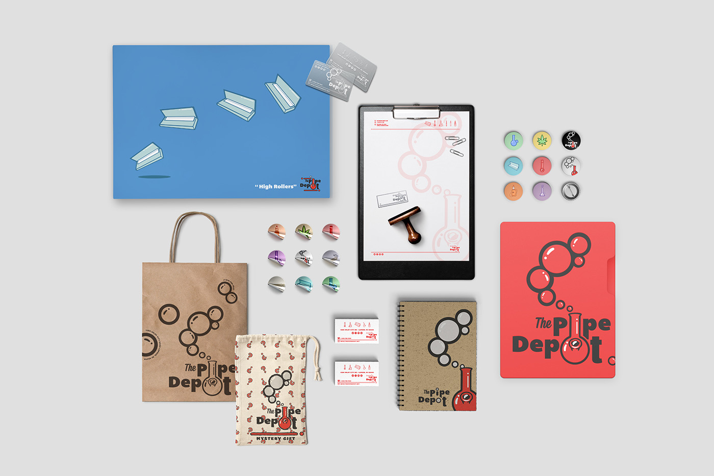
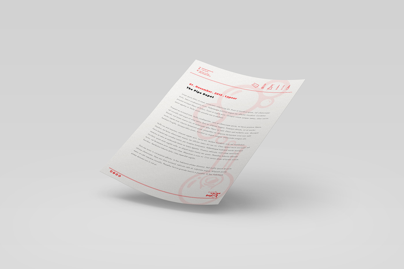
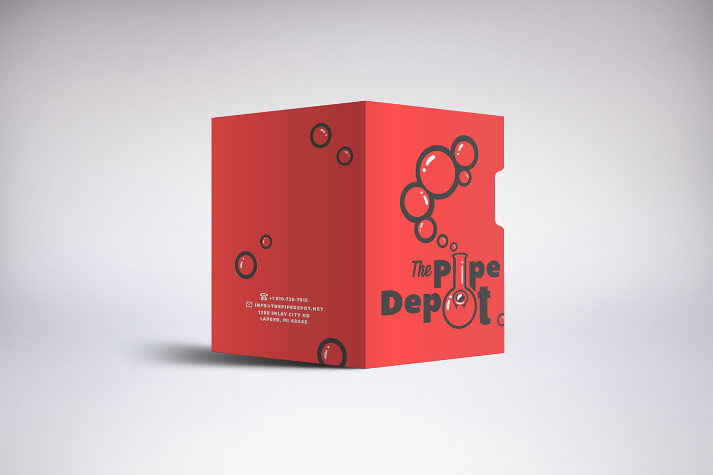
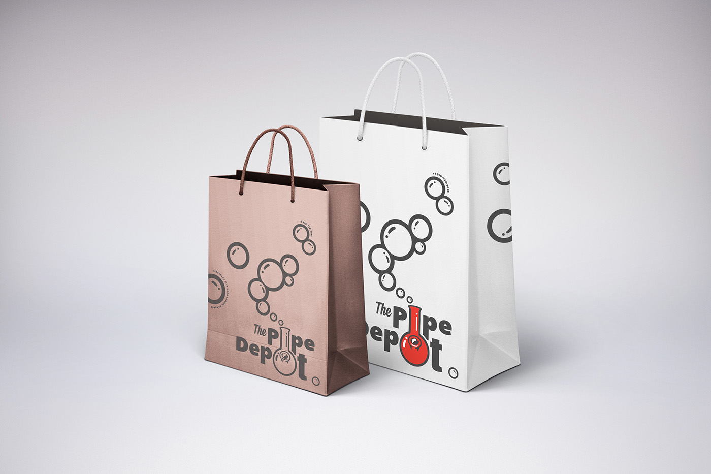
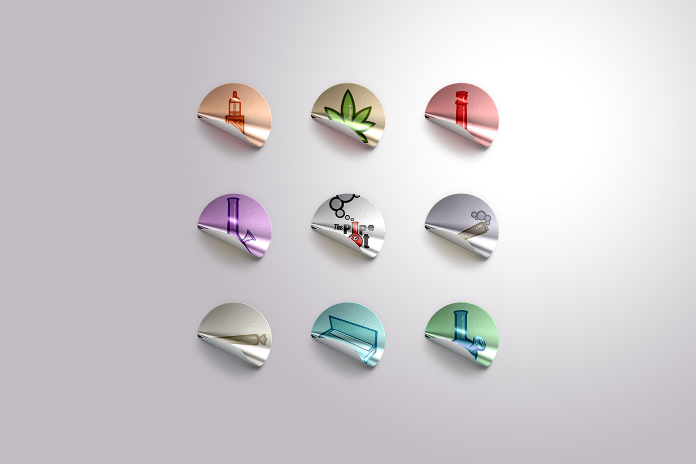
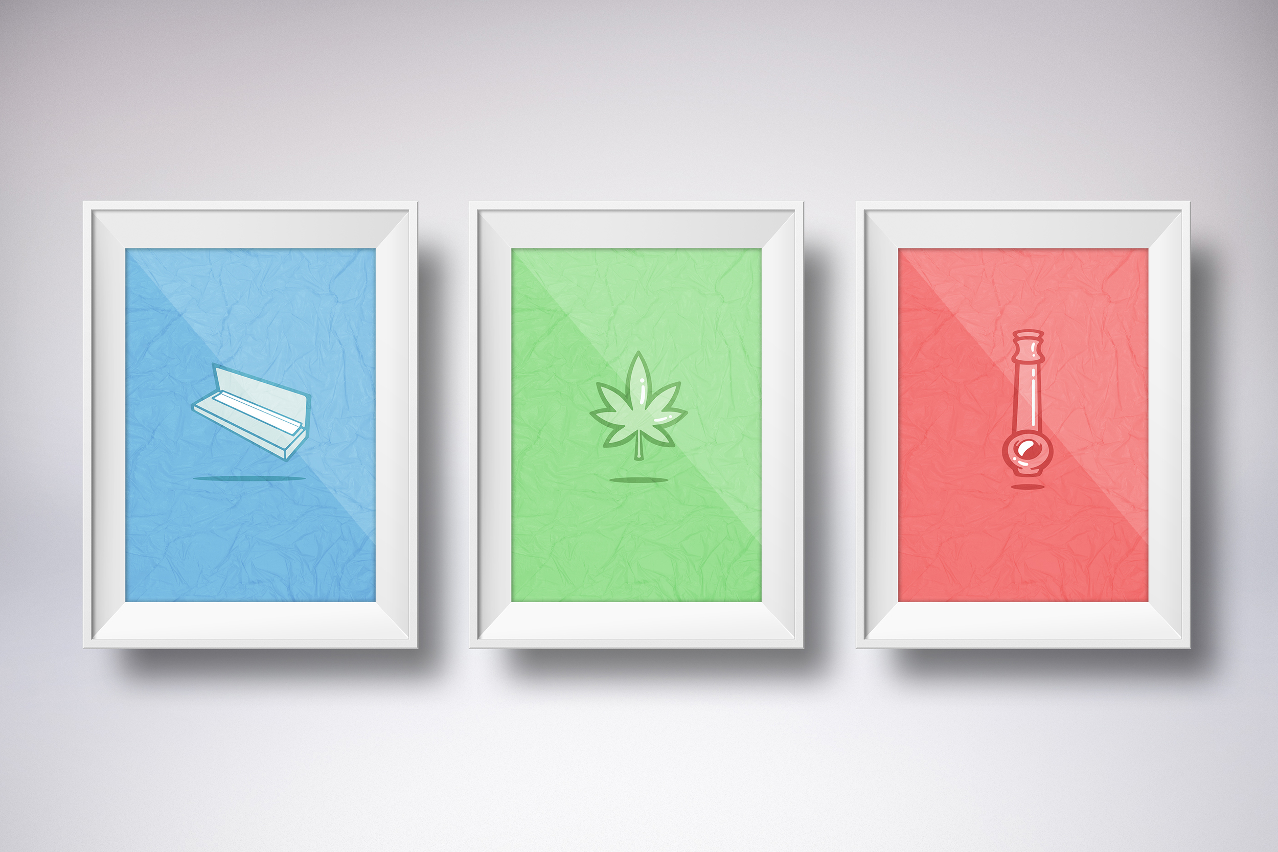
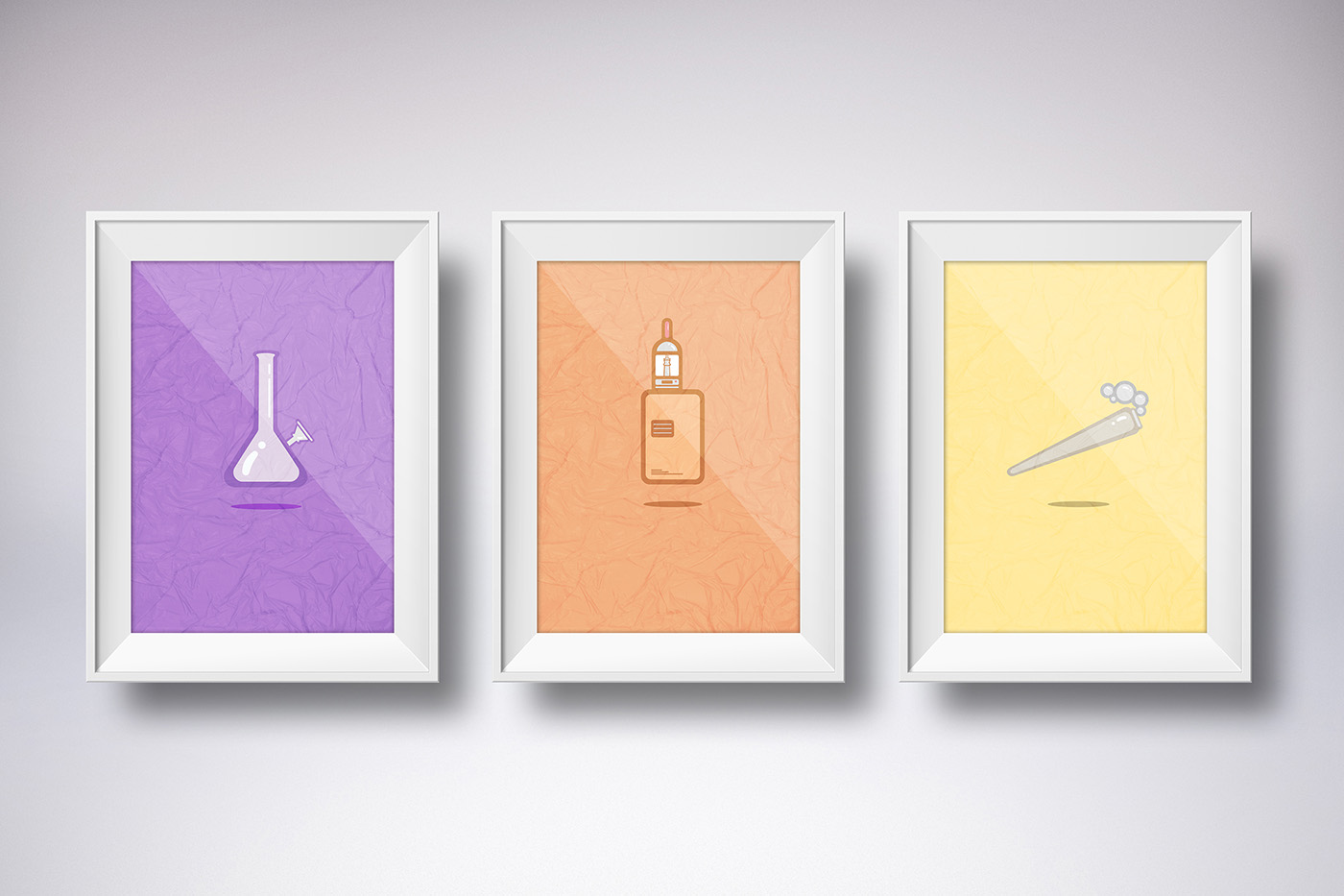
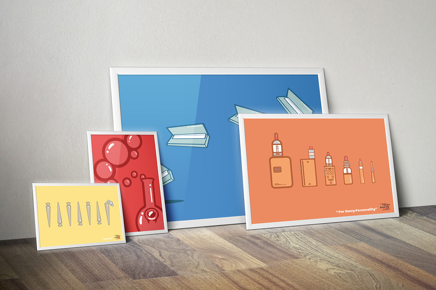
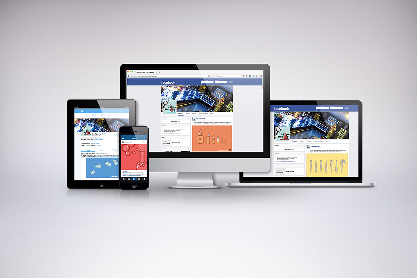
Concept | Rebranding and expanding the visual identity of The Pipe Depot, the cartoon styled art direction is a personal art style of mine that was used to brand the business. Researching into business, the idea was to increase awareness of the shop and product by approaching the art direction with a friendly tone and subtitle color palette to avoid stereotypical stigma of the culture.
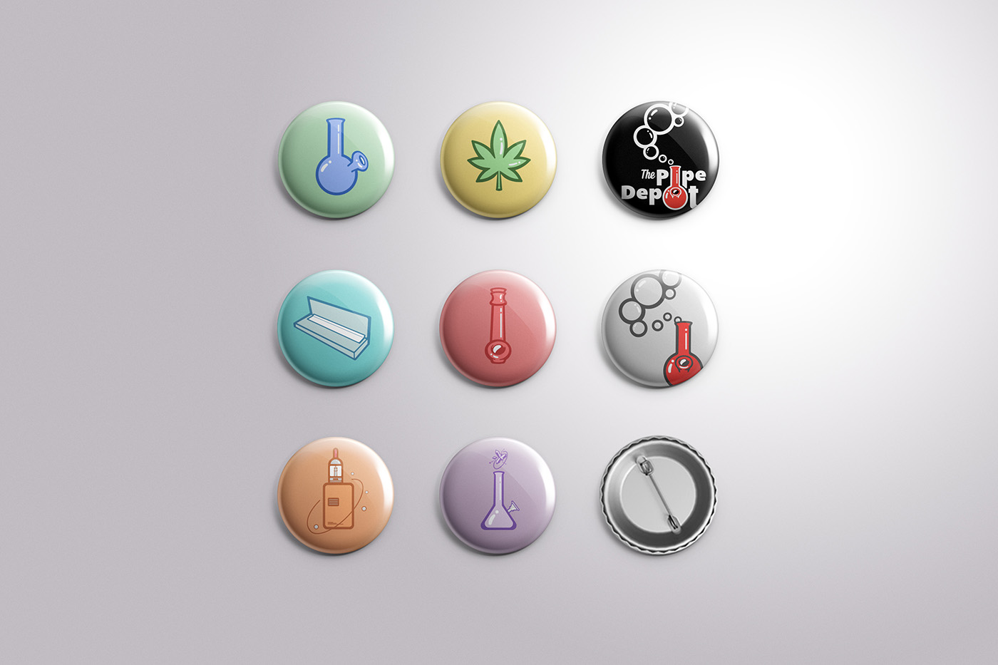
Deliverables | By approaching the branding with a friendly art style, the idea was to expand the business through posters, pins and stickers, using the design alone to promote the business through audience interest and pop culture.
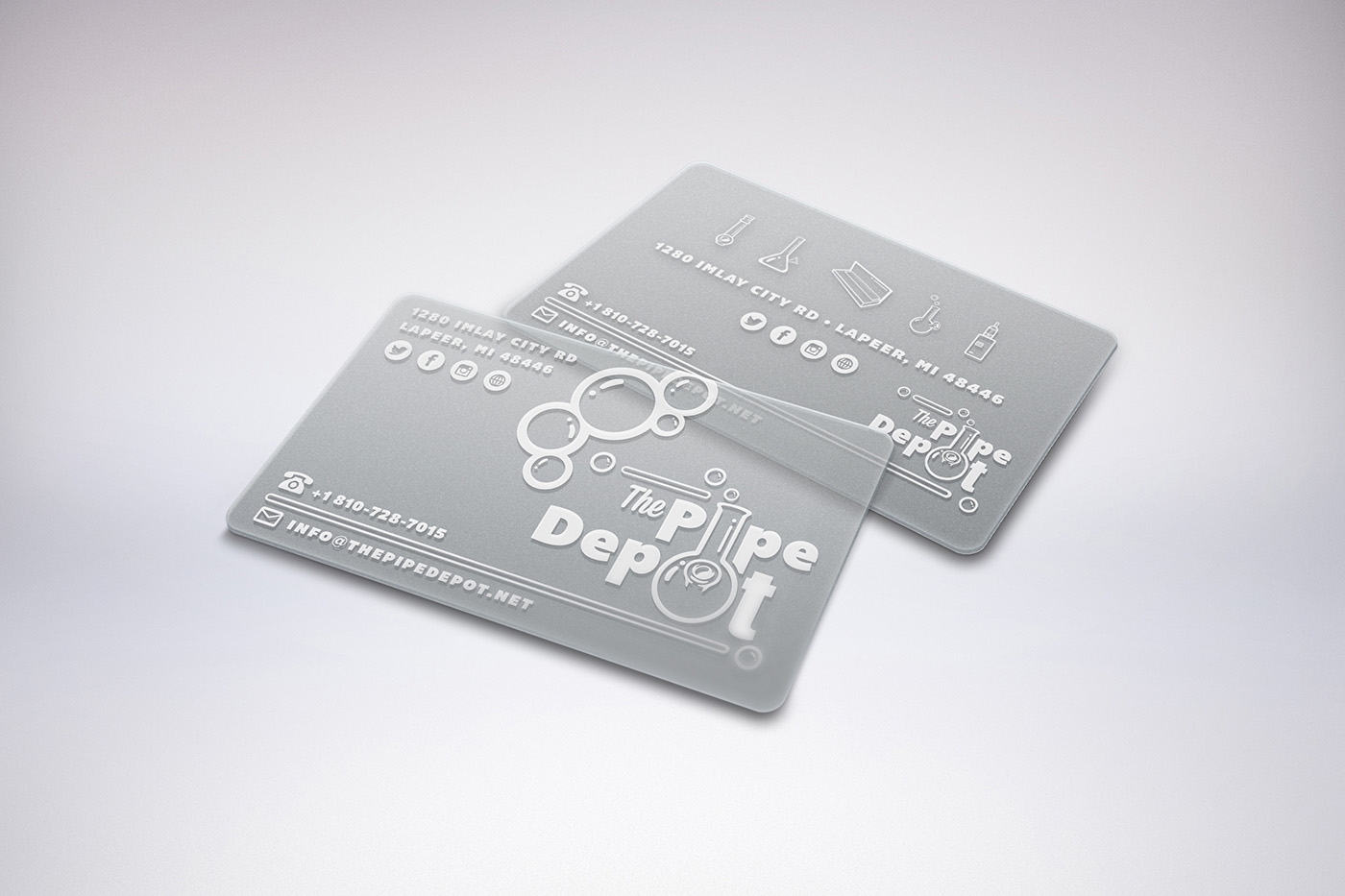
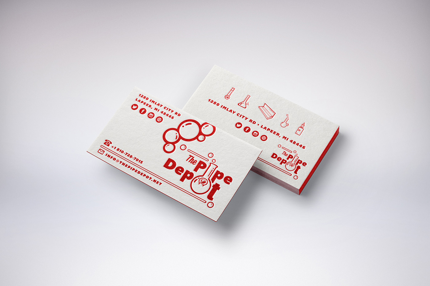
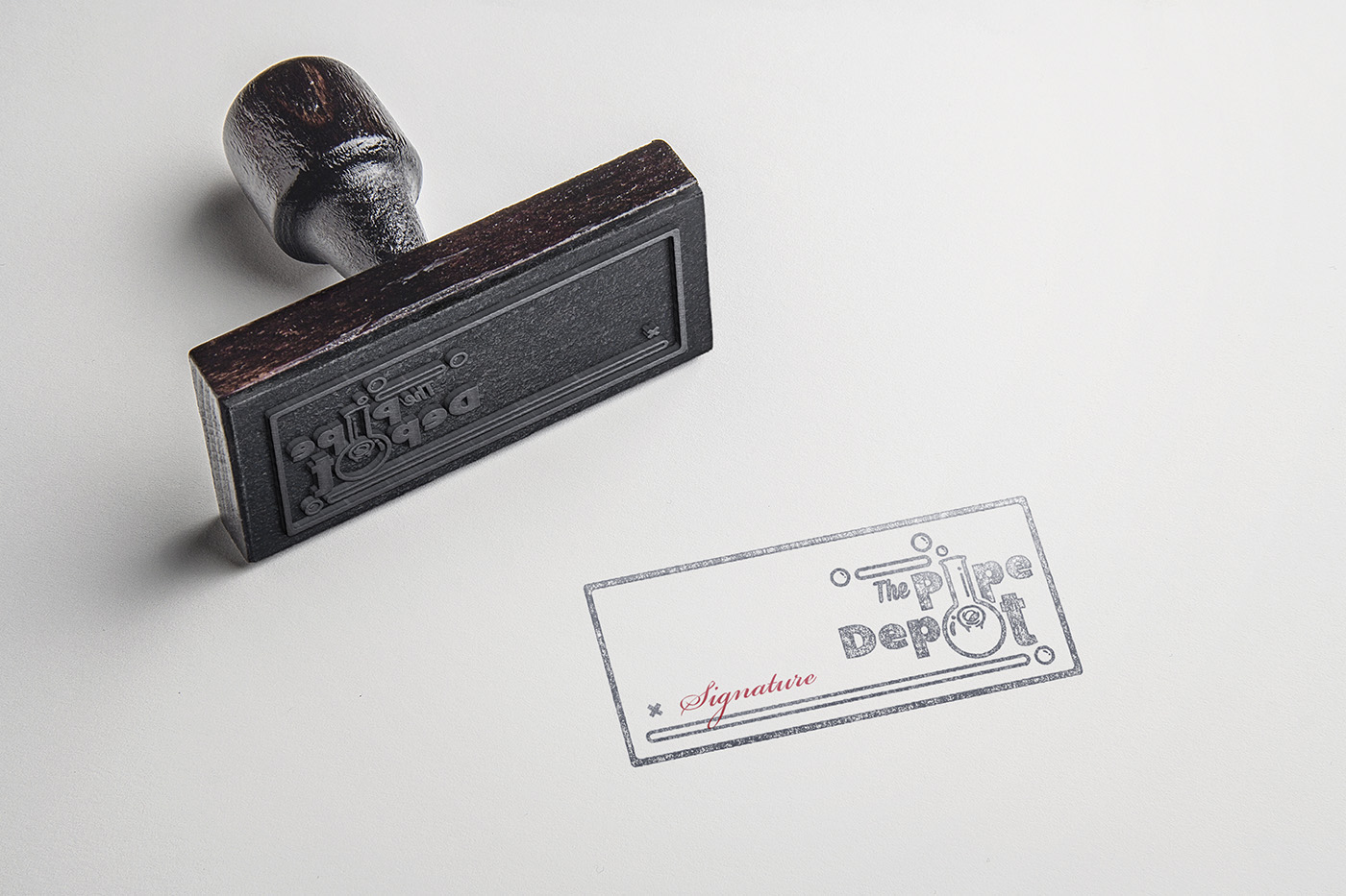
Created were business cards, translucent plastic business cards, shopping bags, a gift bag parcel, letterhead and envelope, a rubber stamp, notebook, folder, pins, stickers, posters, social media channel design and social posts.
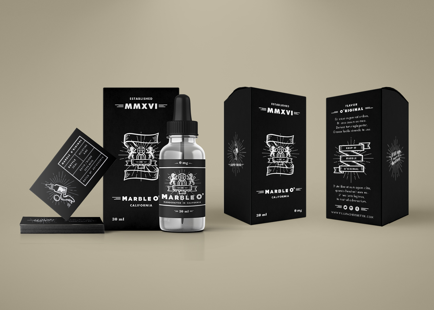
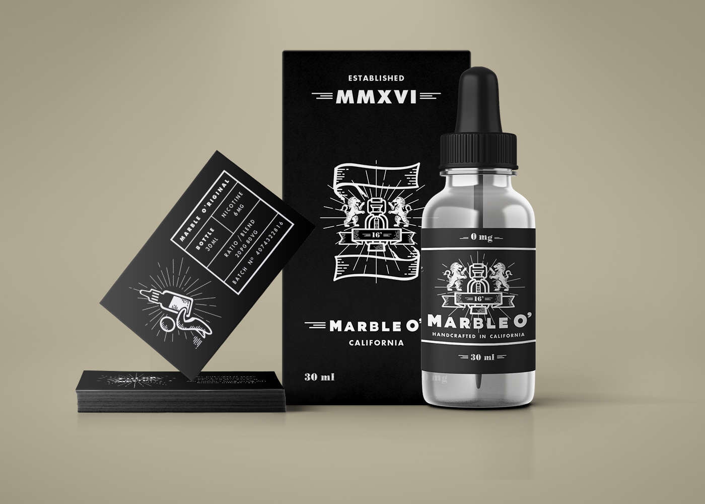
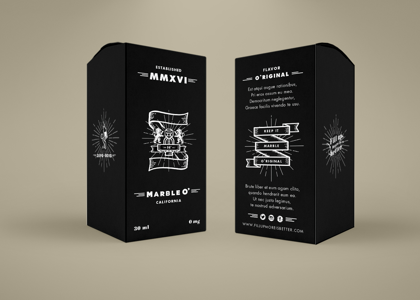
Marble O' E Liquid
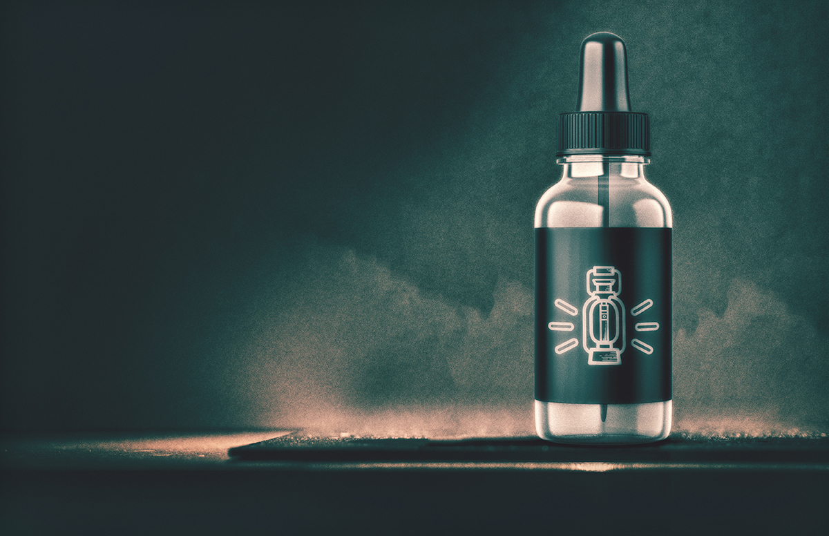
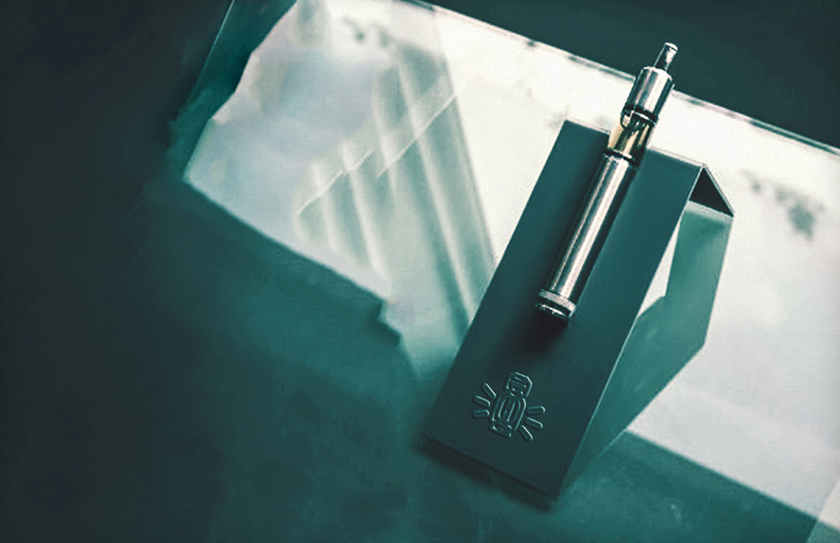
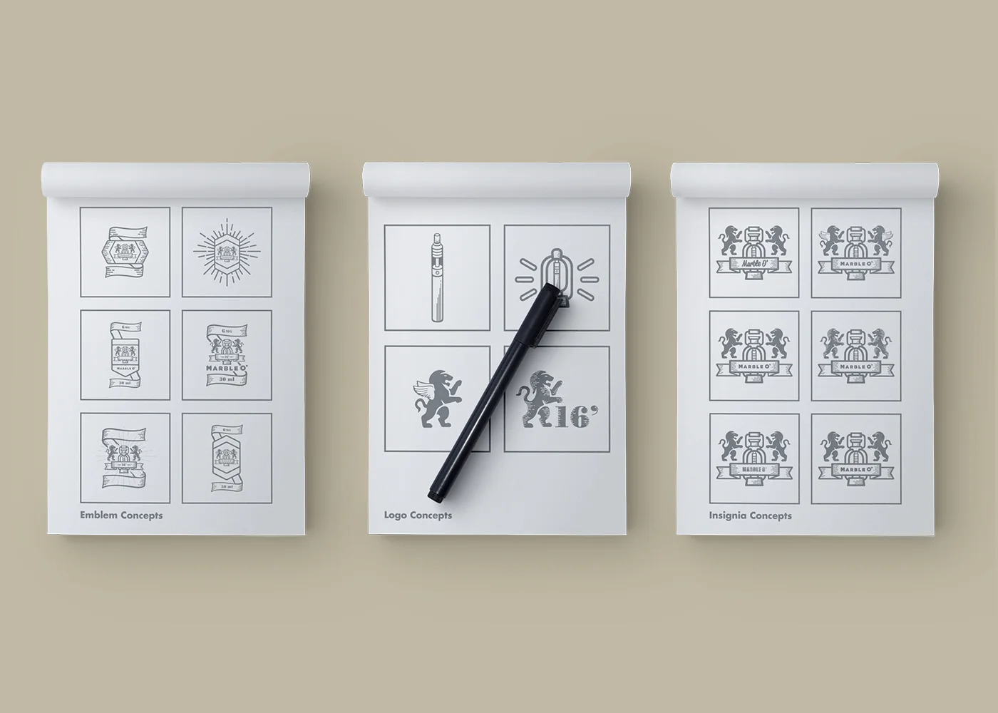
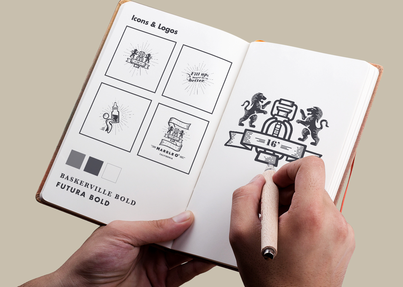
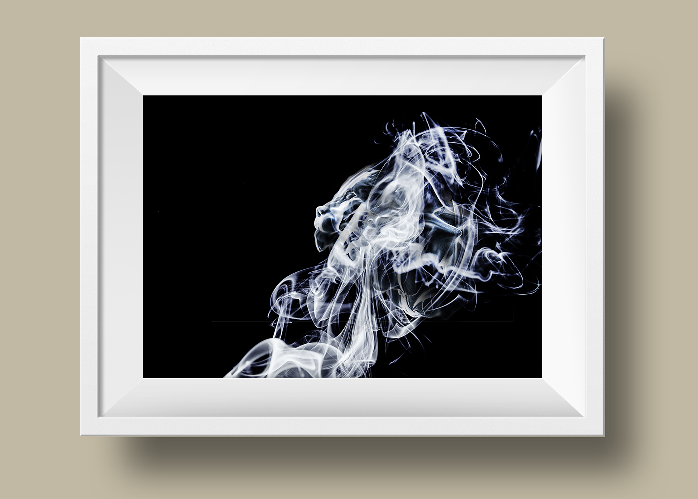
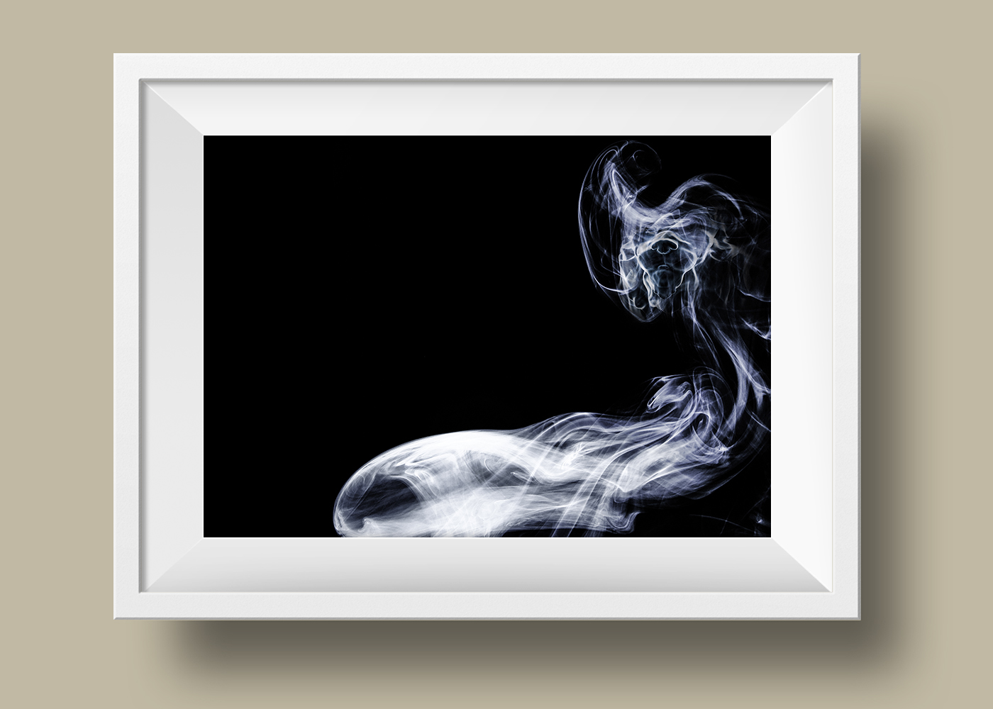
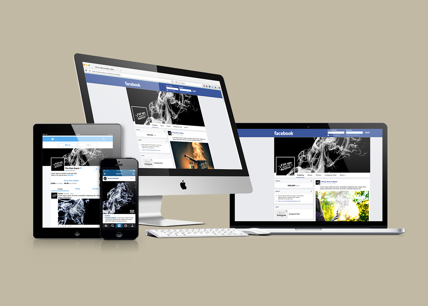
E Liquid Brand. Handcrafted in California. Summer '16. Client had an idea to produce a high end E-liquid. Developing the brand and creative direction, a brand guidelines were created with a mascot rendered in Sculptris/Zbrush. Deliverables include branding, digital and print deliverables
Role Creative Direction + Art Direction + Graphic Design | Tools Photoshop CC, Illustrator CC, Sculptris



Serenity Auto
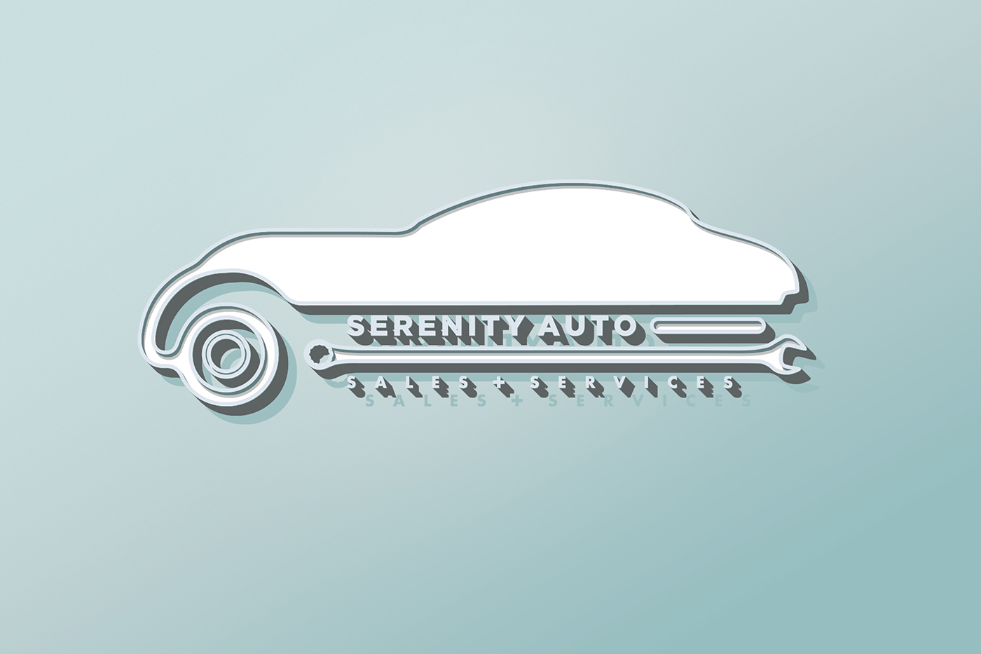
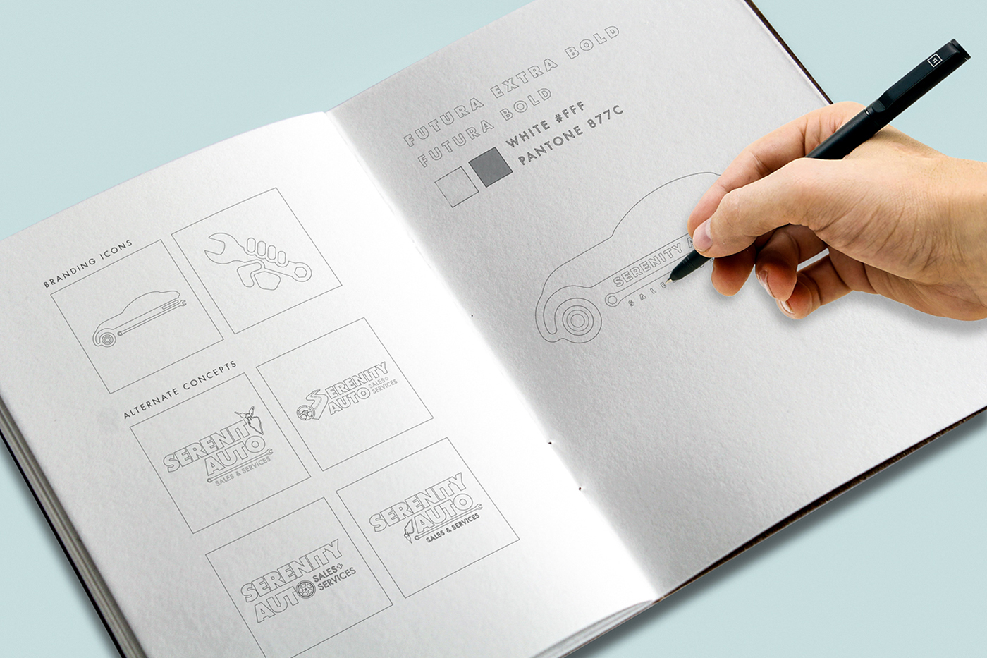
Concept | Being a small business recently opened, the idea was to create a polished, minimalist design, invoking the idea of "Quality over Quantity".
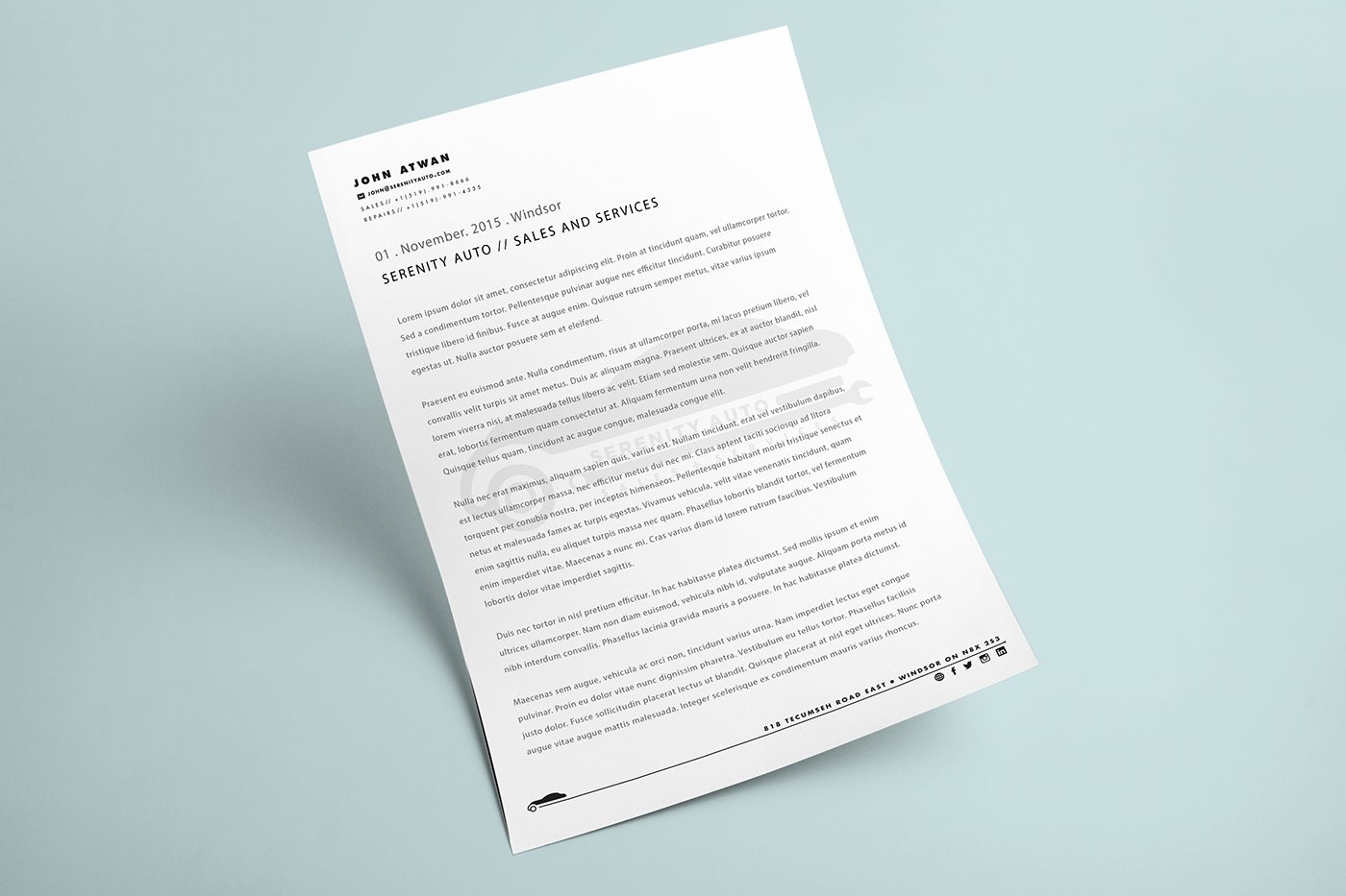
Blending modern minimalism of today and the touches of the 1930's automotive industry, the logo was to encompass the two main services of the business; being a used automotive dealership and mechanic shop in one.
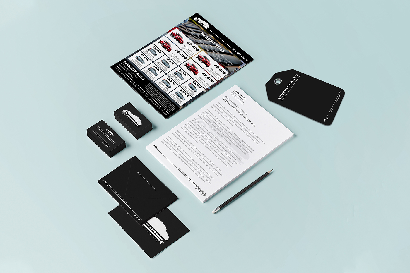
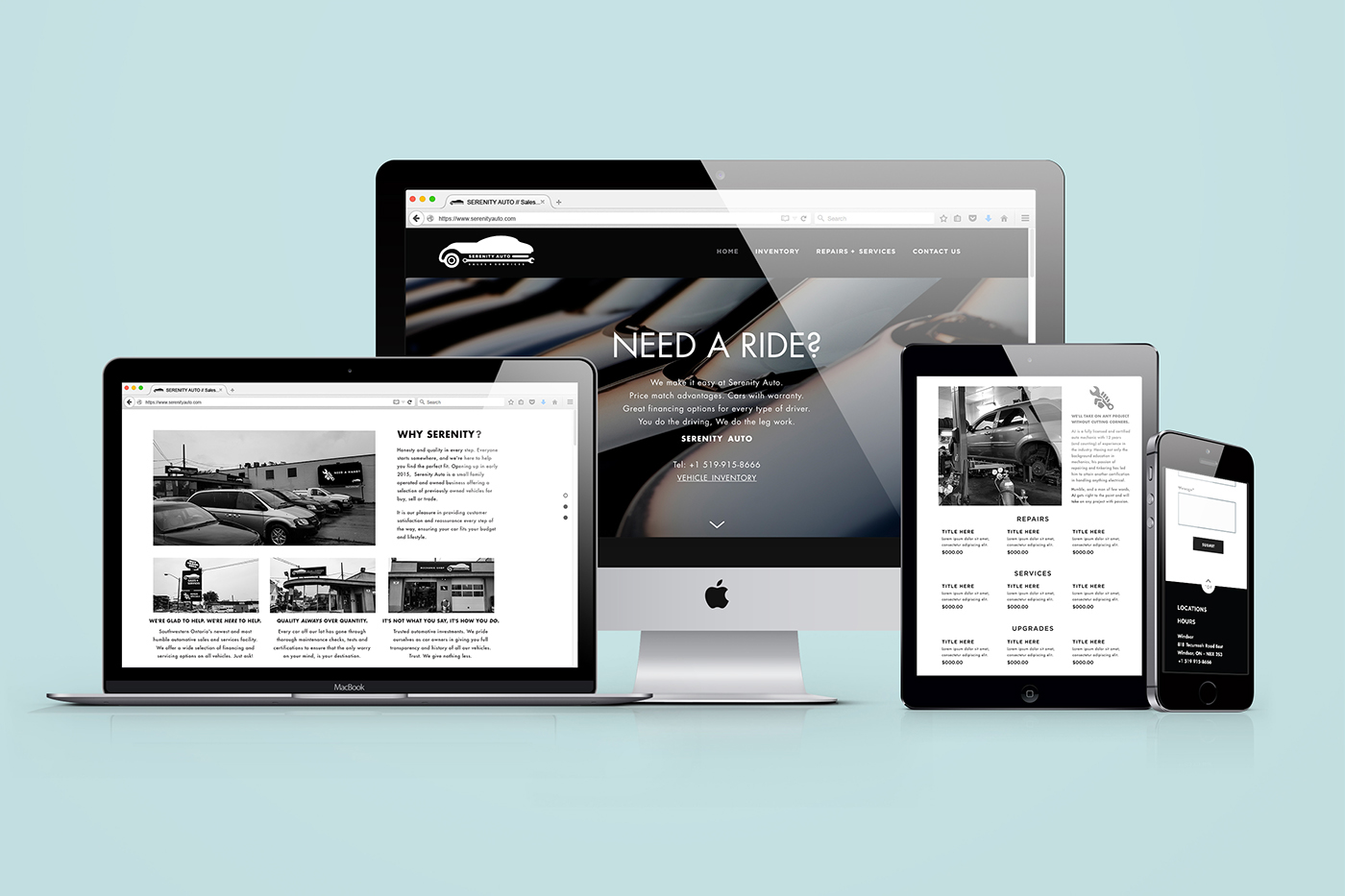
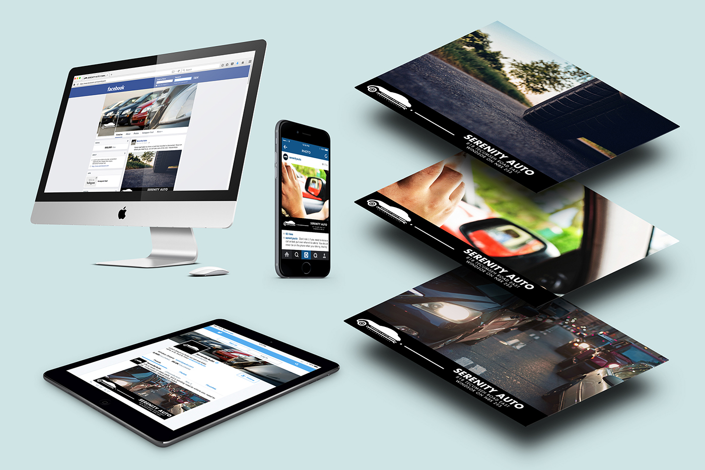
Deliverables | Working with the client, the main objectives were to do a full rebrand of the business and set up an online digital presence while still using traditional methods of marketing that the client can use. Since inventory at the dealership is low, a quick responsive website was made where people can freely look at the rotating inventory and auto services that Serenity Auto offers.
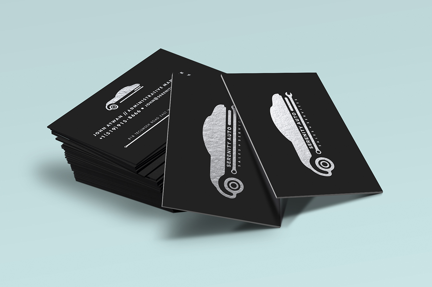
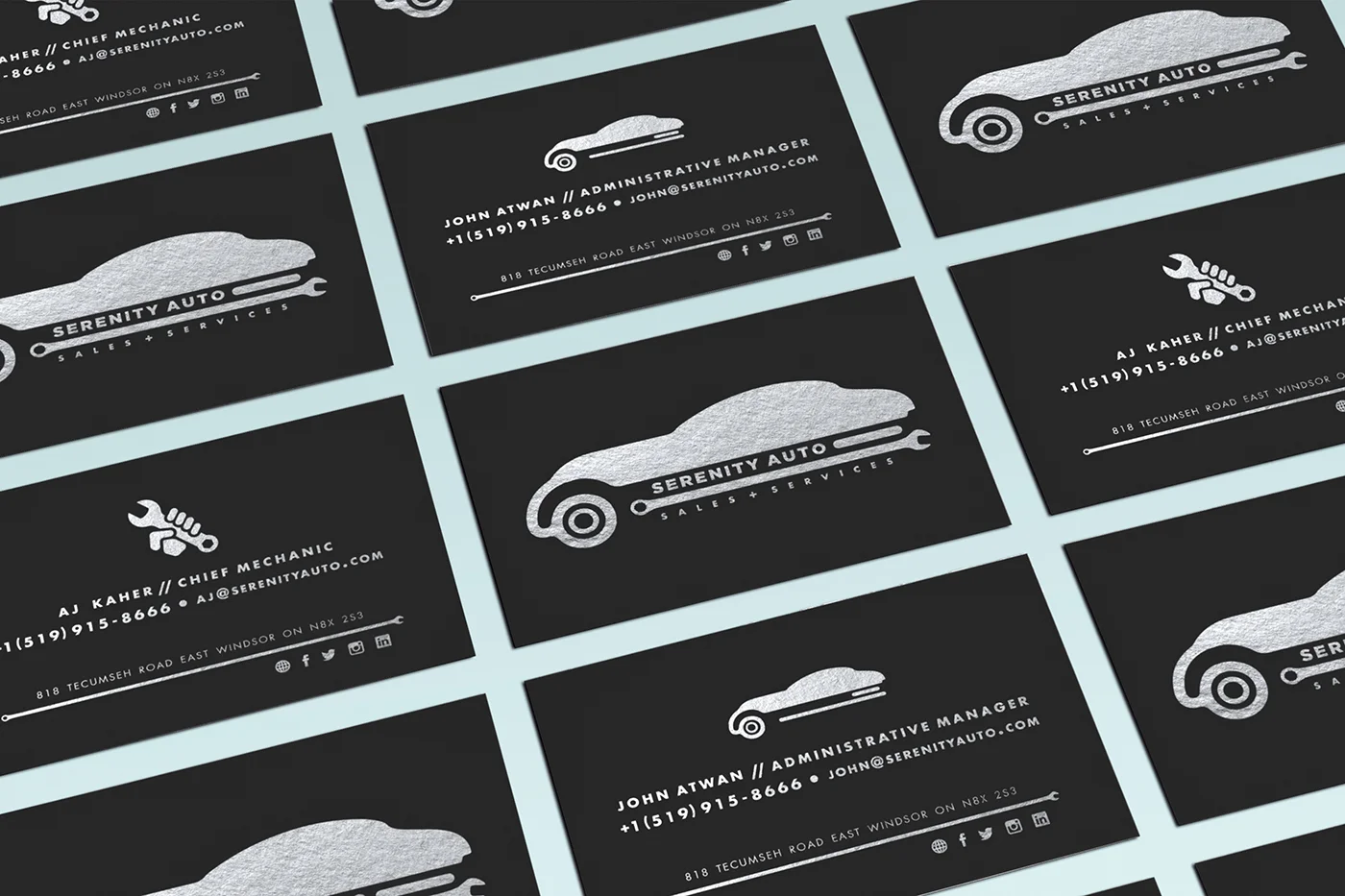
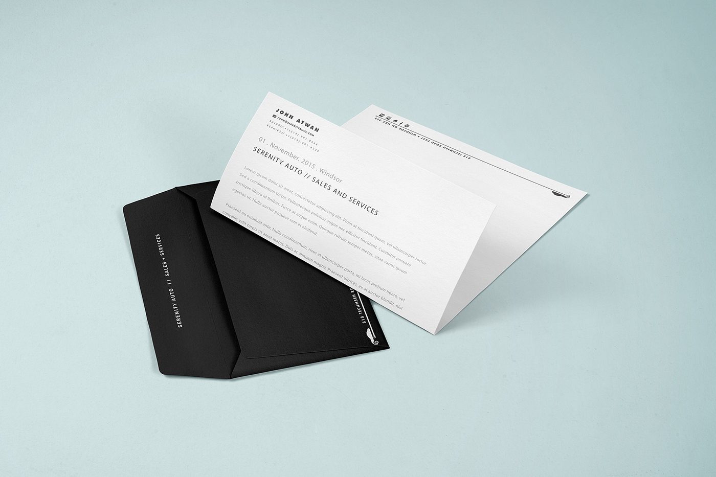
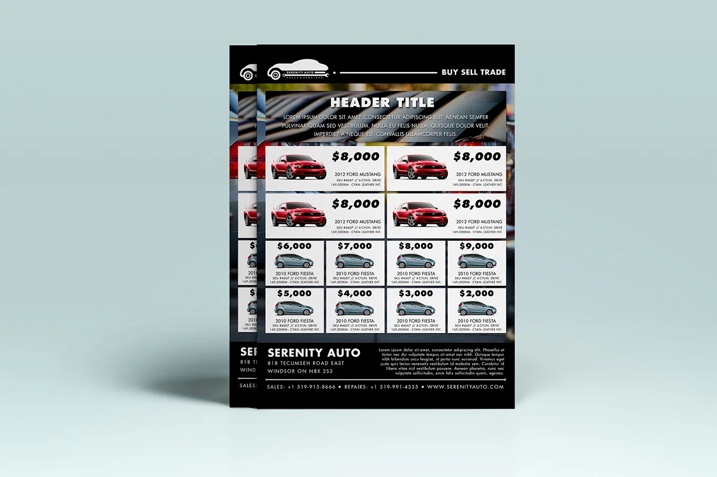
Created were business cards, envelope and letterheads, a flyer template, automotive sales tag, full responsive website, and social media channels with social posts aligned to promote the branding of the business.
Role Creative Direction + Art Direction + Graphic Design
Babylon Express Branding
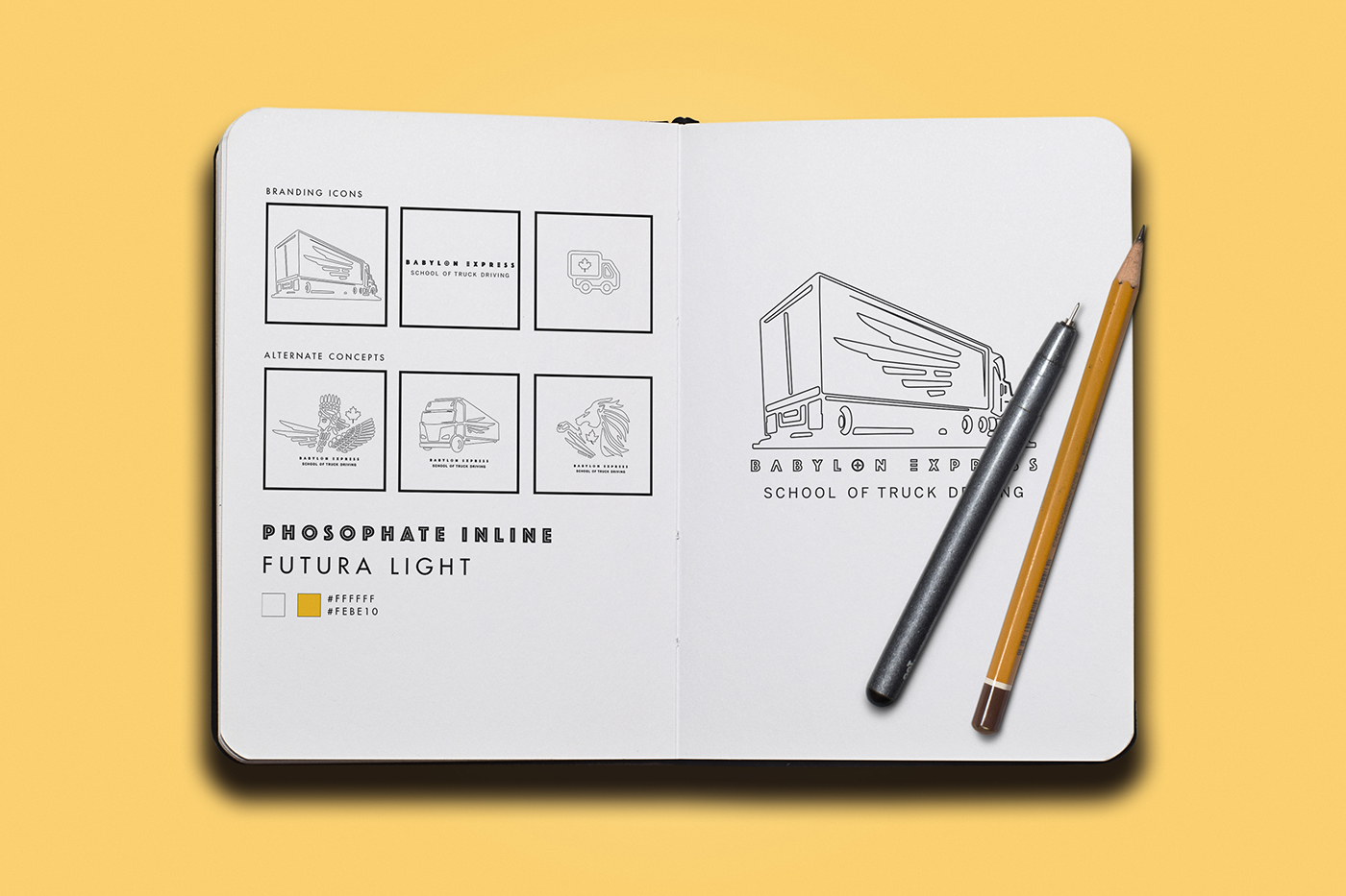
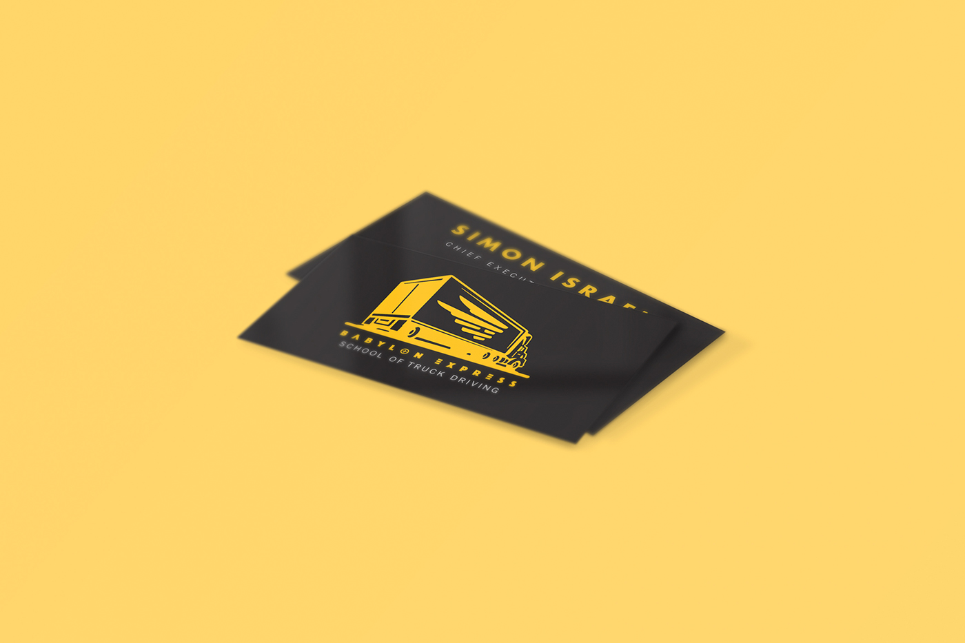
Concept | Babylon Express takes a step into the client's culture, having roots with Ancient Mesopotamia. The main objective was to rebrand the business to appeal to all age ranges, primarily to a younger audience into the trucking industry.
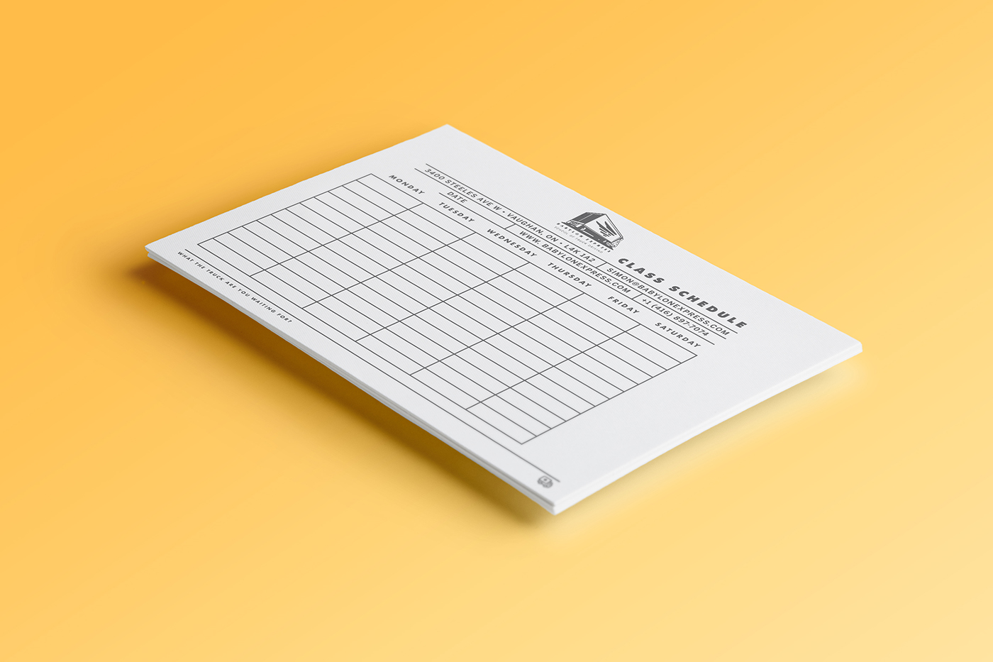
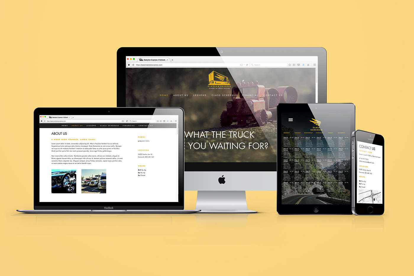
Deliverables | Consulting with client, the deliverables were to do a full brand design and online presence. Since the business is small, a responsive one-page landing page was created, where potential students can get class schedules and information on the school with a clean simplistic design.
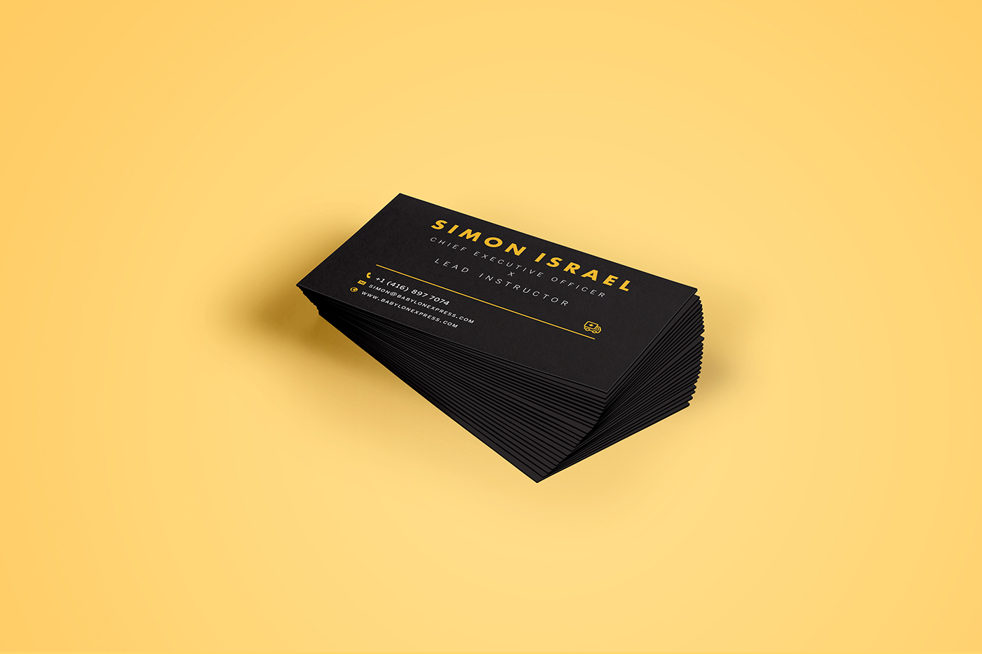
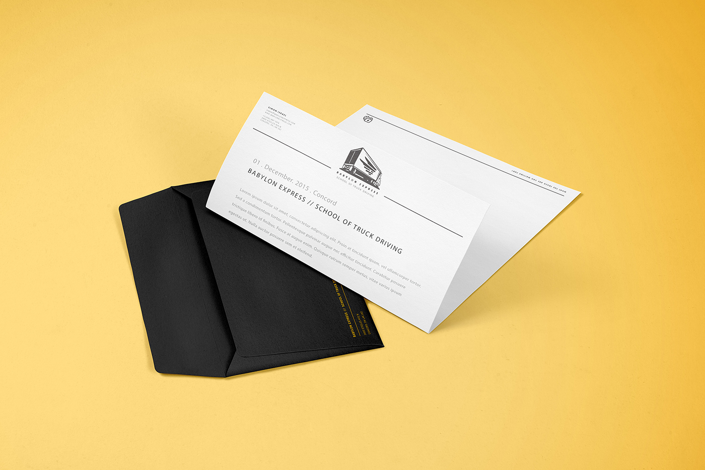
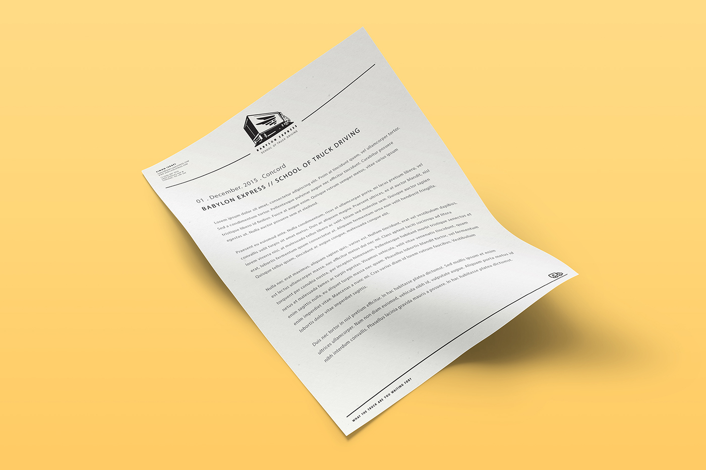
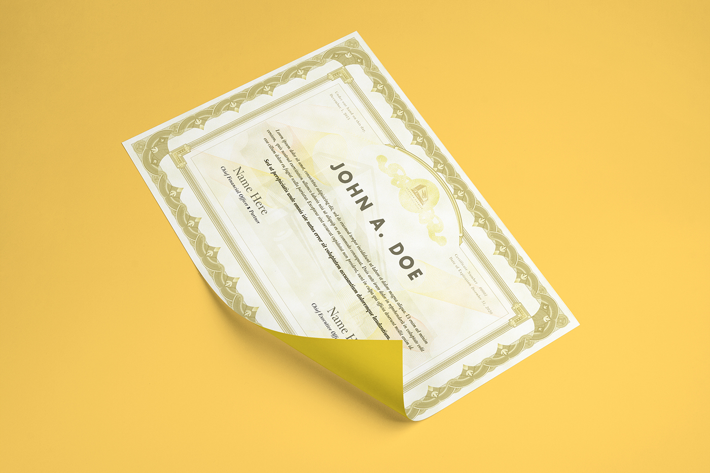
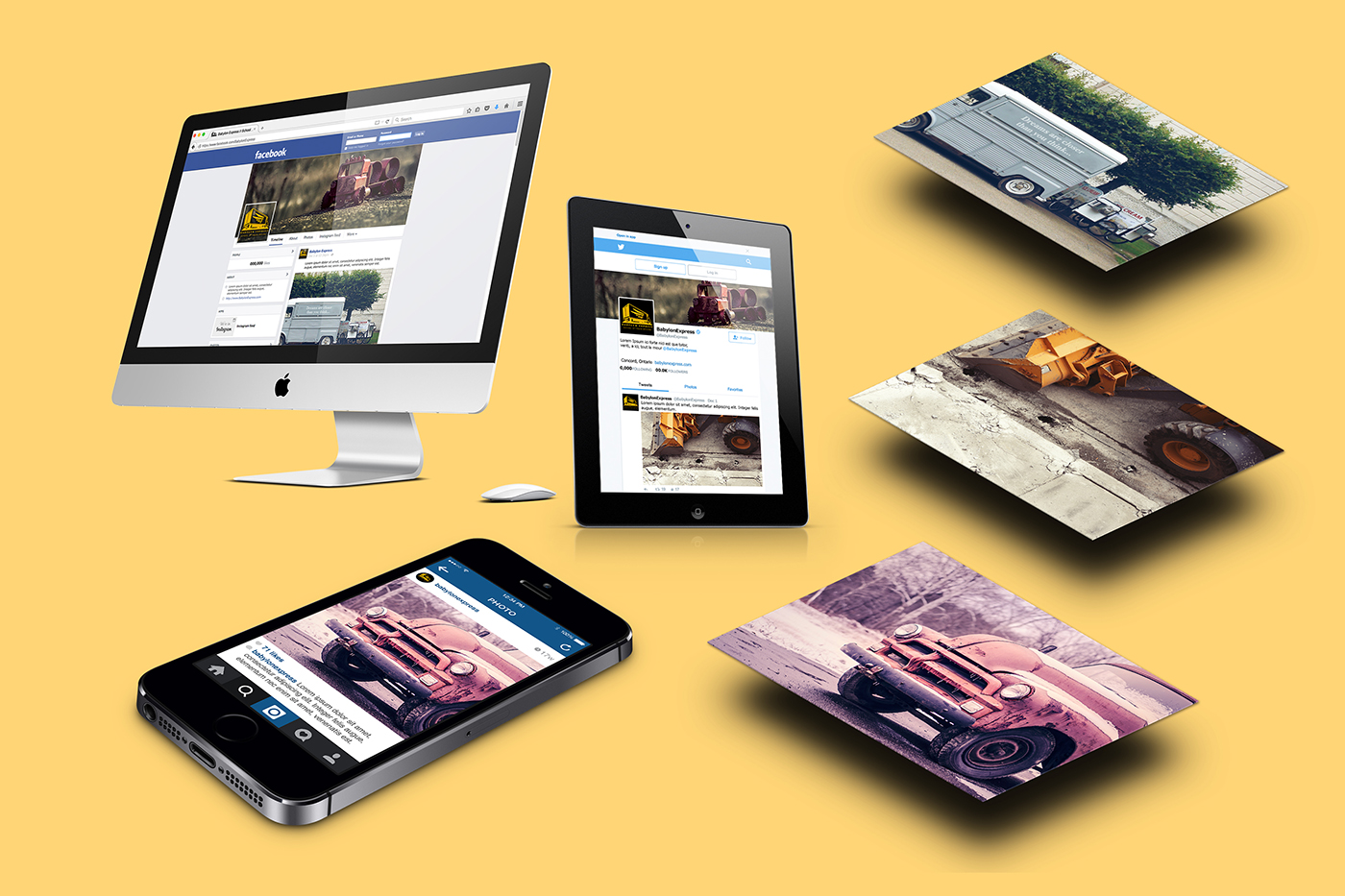
Created were business cards envelope and letterheads, school certificate, class schedule template, responsive one-page website, and social media channels with social posts aligned to promote branding and education of truck driving.

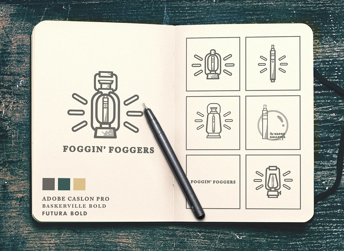
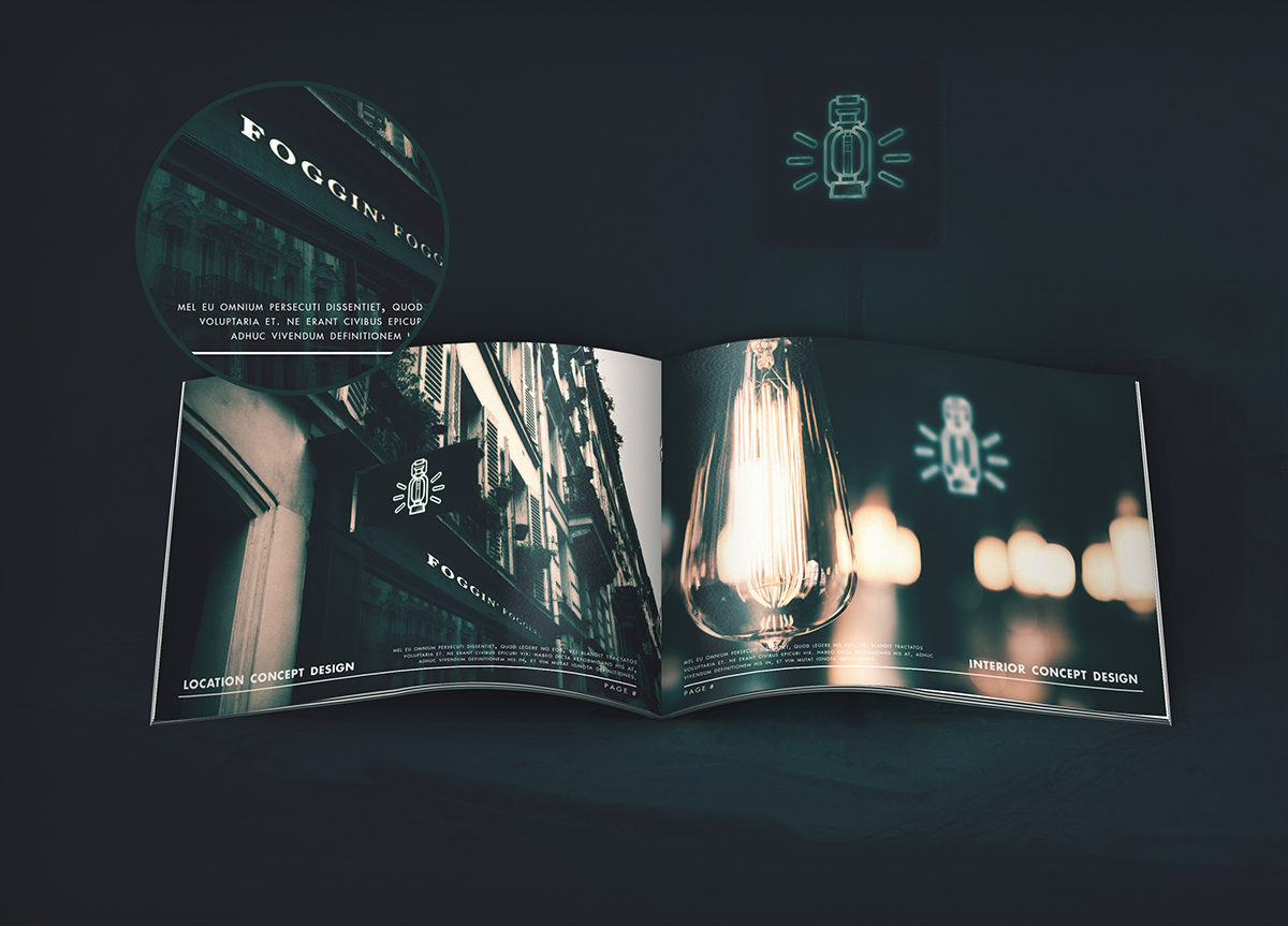
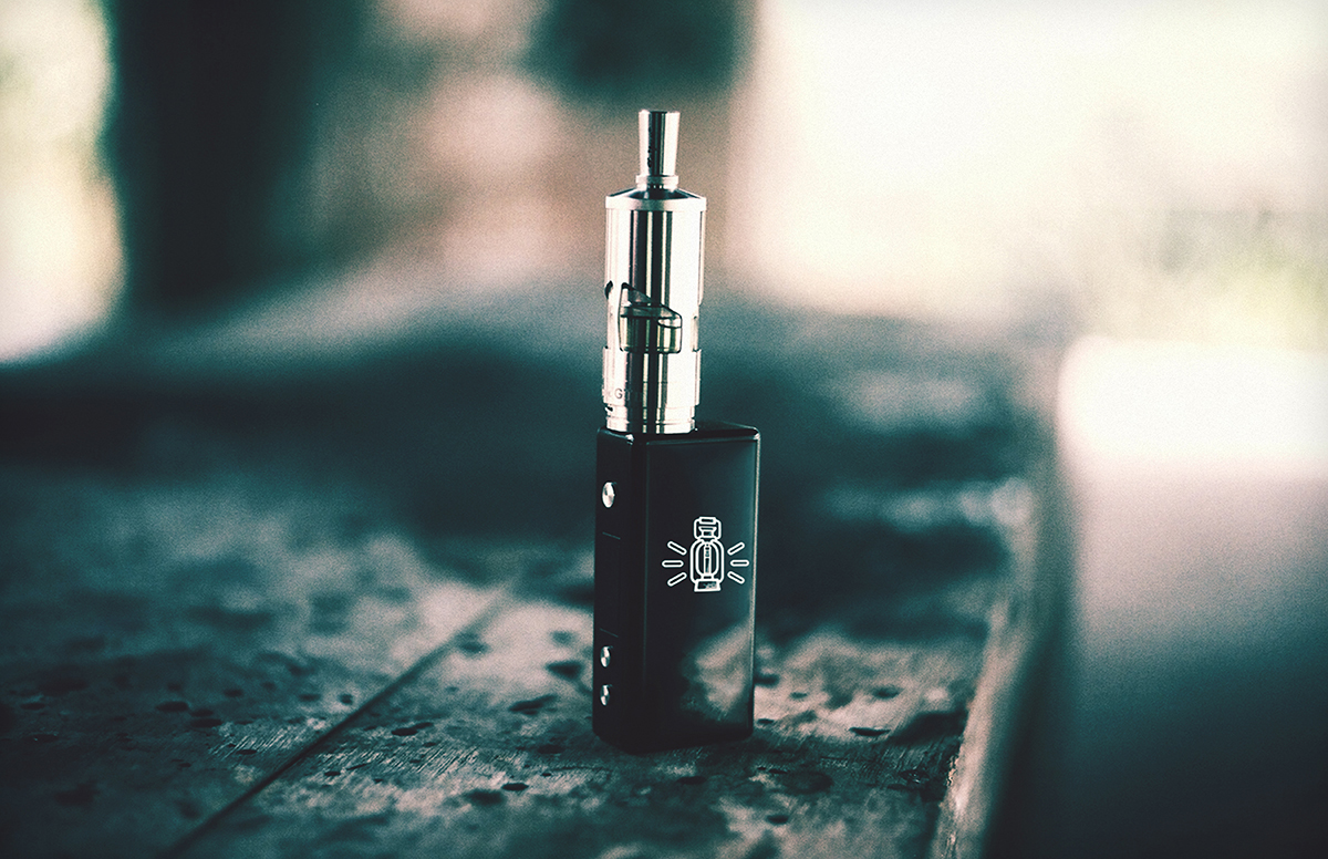
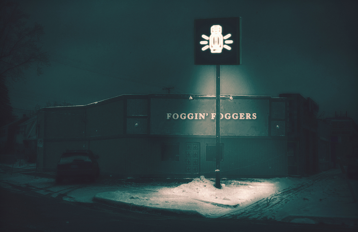
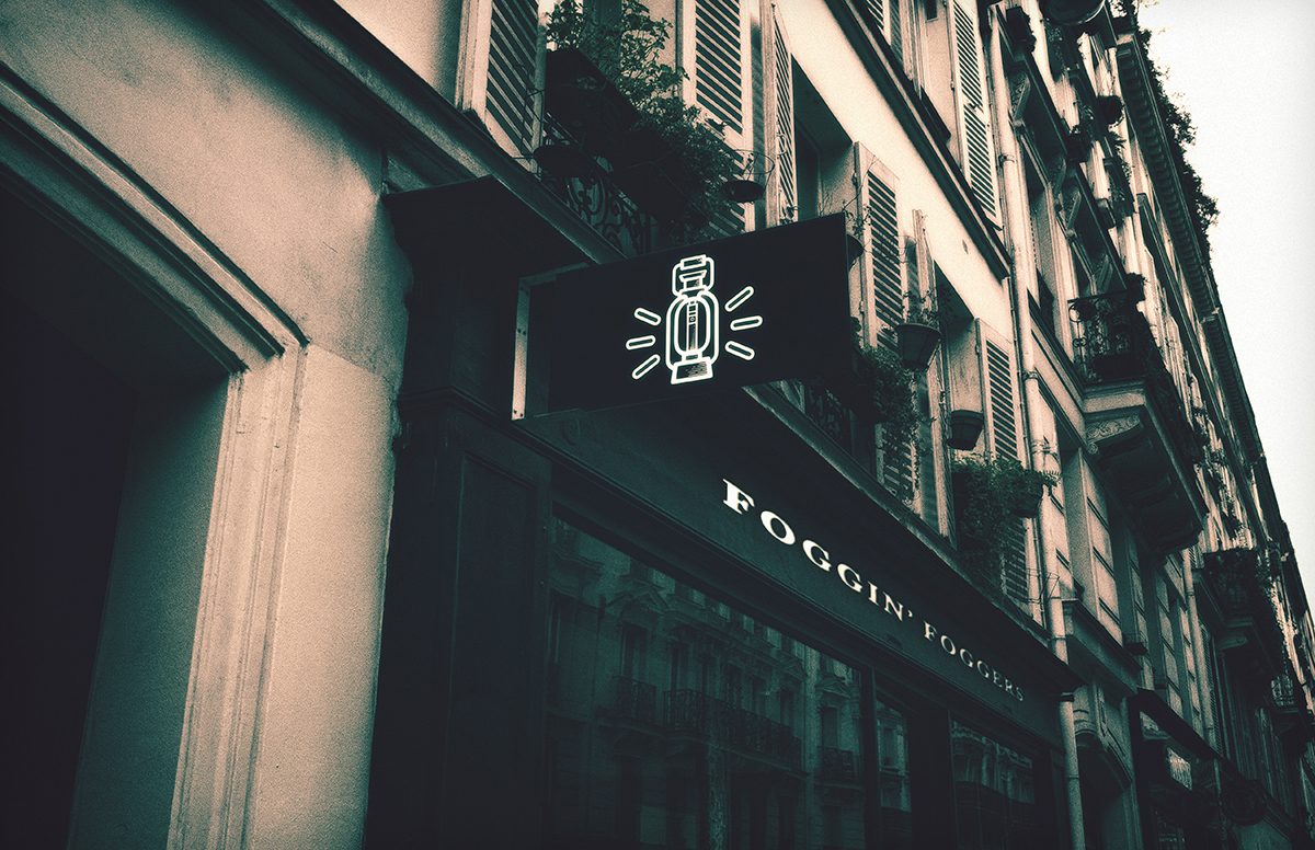
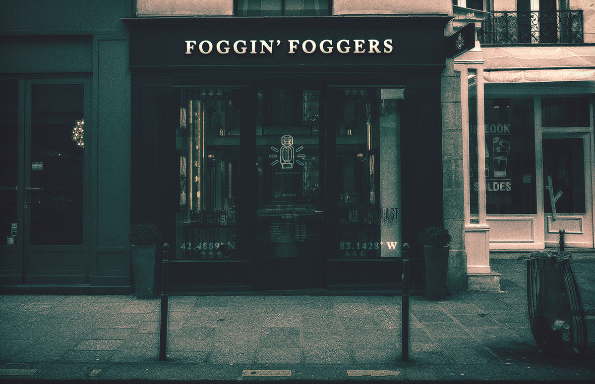
Foggin' Foggers Branding
E-Liquid Boutique Shop. Catering to high end consumers. Client wanted a new look and feel to an already preexisting stigma with all types of smokers. Deliverables include branding and concepting, presentation package for investors, social media.
Role Art Direction + Graphic Design
